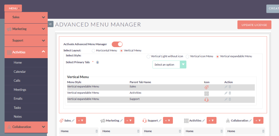
Configure stylish and functional menus in SuiteCRM that are more relevant to your team’s needs and match your branding. The Advanced Menu Manager add-on enables you to choose different menu layouts and designs from the Admin settings – no designer needed!
User Guide
Steps For Using Advanced Menu Manager Features :
Step 1:
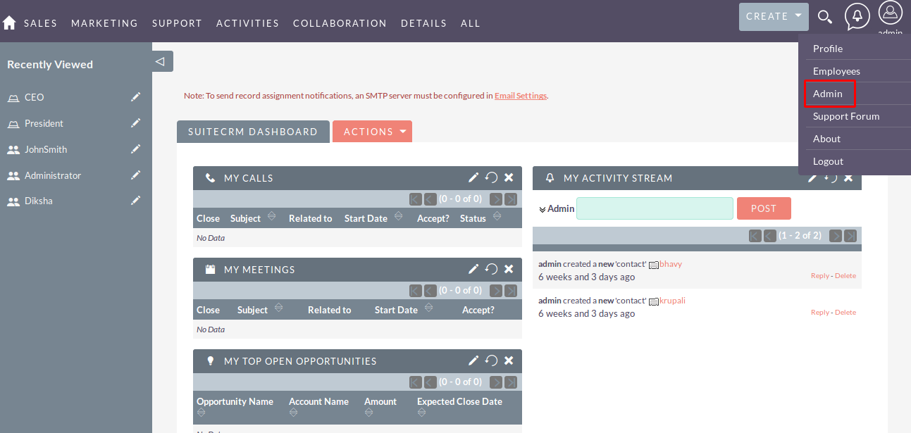
To open the Administration Page, Click on the Admin tab as shown in below screenshot.
Step 2:
Open Administration page, Click on the Advanced Menu Manager from the Other Section.

Step 3:
After Click on “Advanced Menu Manager” Link from Admin, Configuration Page open as you see in below screenshot.

Step 4:
In Advanced Menu Manager Configuration page, check Activate Advanced Menu Manager checkbox. Once you Activate Advanced Menu Manager, Menu layout, Primary Tab Menu and it’s sub item should be displayed.
Step 5:
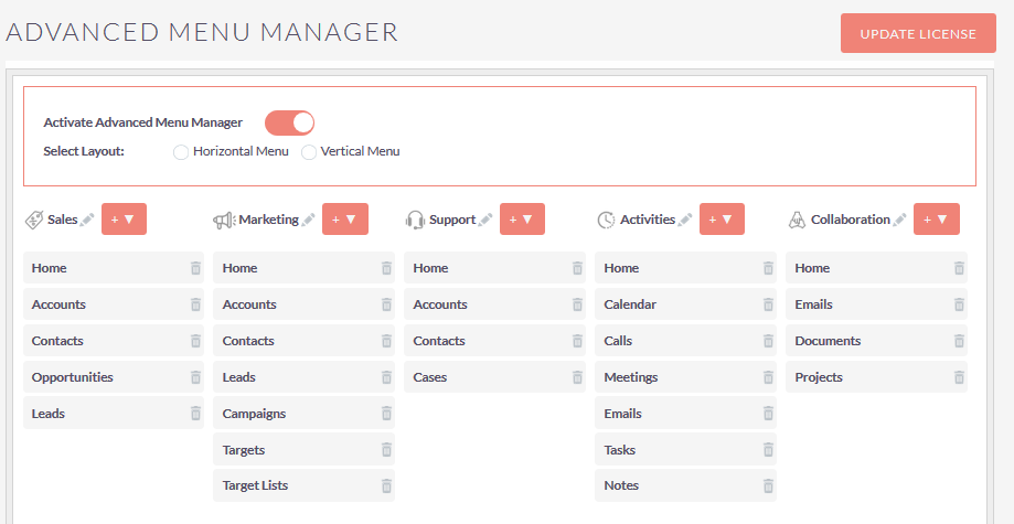
If you select Horizontal Menu from layout and selected style is Group Menu then, the configuration page will be shown as below screenshot.

Step 6:
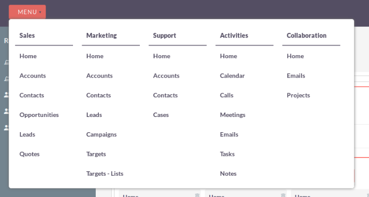
If you select Horizontal Menu from layout and selected style is Group Menu then, the Menu will be shown as below screenshot.
Step 7:
If you select Horizontal Menu from layout and selected style is Menu with icon then the configuration page will be shown as below screenshot.
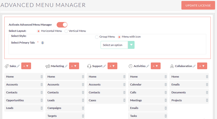
Step 8:
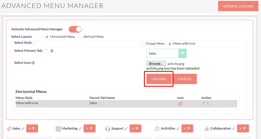
If selected layout is Horizontal Menu and style is Menu with icon then you can able to add your own icon for selected Primary Tab..
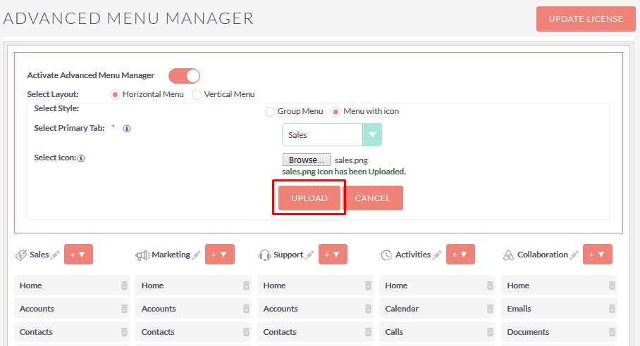
Step 9:
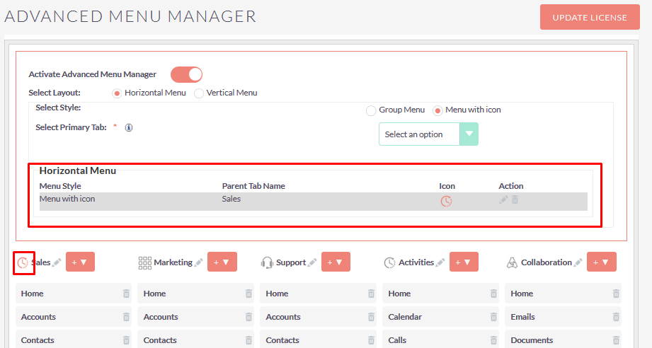
Once you click on the “UPLOAD” button, icon will be change for particular Primary Tab as you shown in below screenshot.
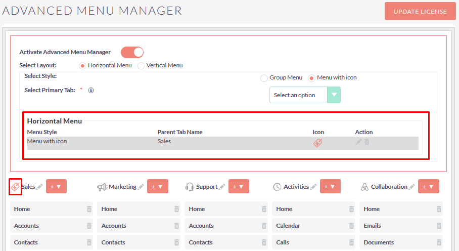
Step 10:
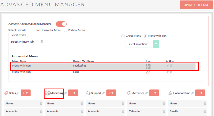
If you select Primary Tab and click on “UPLOAD” button without selecting any icon, default icon should be added for selected Primary Tab as shown in the below screenshot.
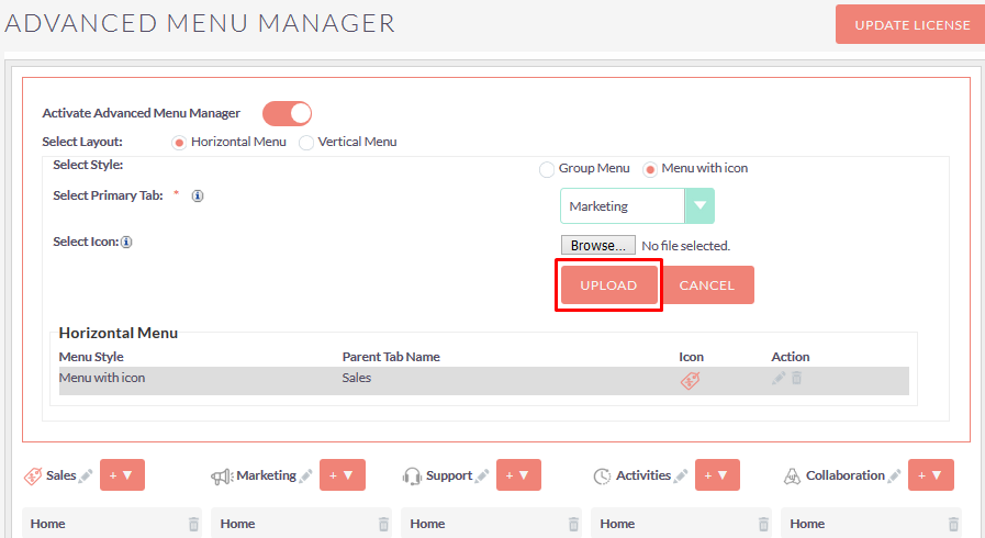
Step 11:
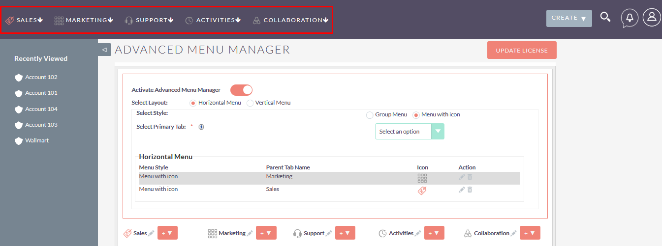
If you select Horizontal Menu from layout and selected style is Menu with icon then the Menu will be shown as below screenshot.
Step 12:
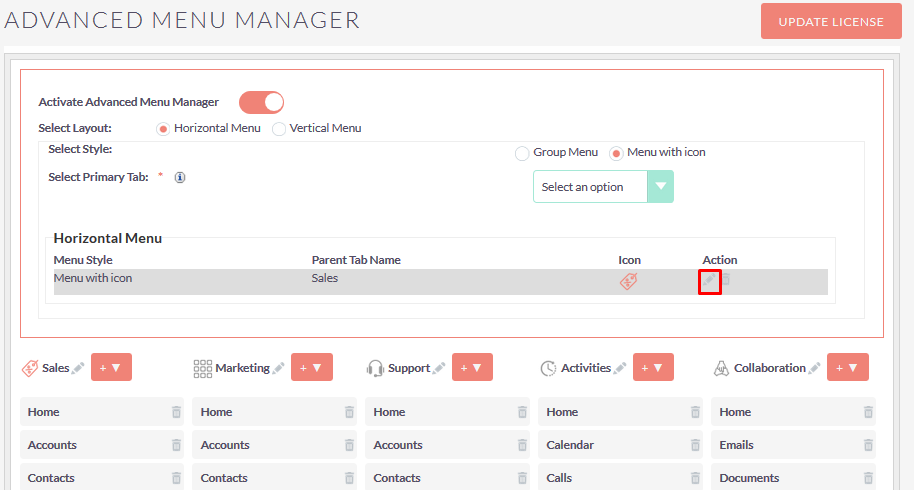
To update uploaded icon, click on the pencil icon as shown in the below screenshot.
Step 13:
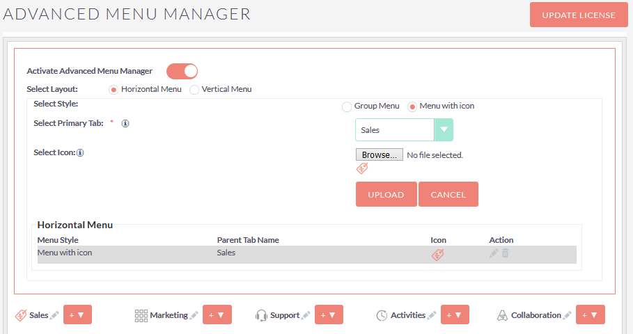
After change icon, Click on the “UPLOAD” button and you will able to see the updated icon for that Primary Tab.
Step 14:
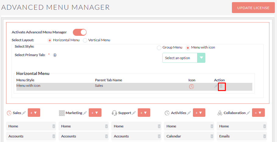
To delete custom icon Record, Click on the delete icon as shown in the below screenshot.
Step 15:
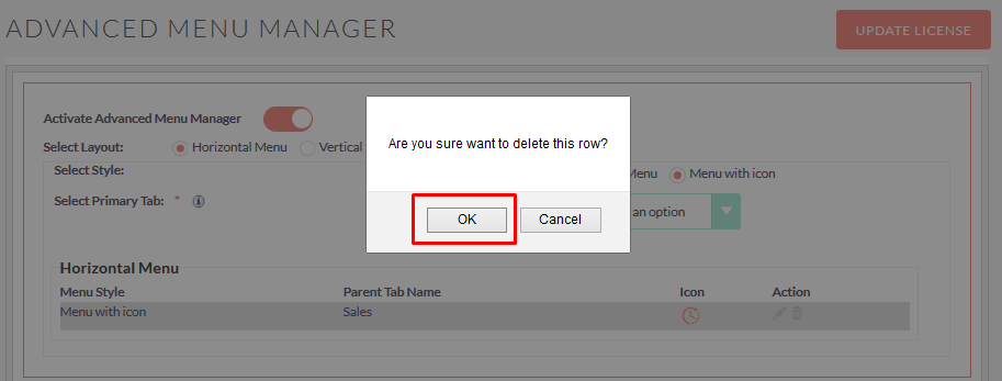
Once you Click on the Delete icon, Alert Box will be displayed. If you click on the OK button from Alert Box, the record will be deleted.
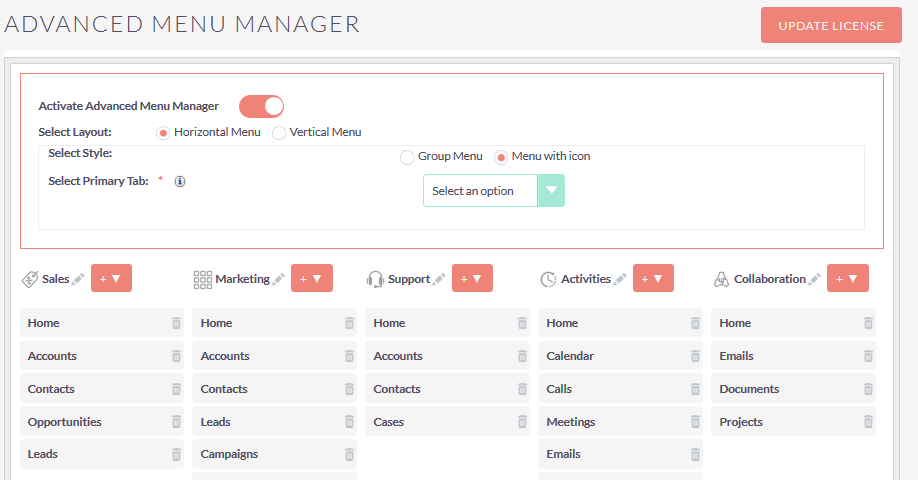
Step 16:
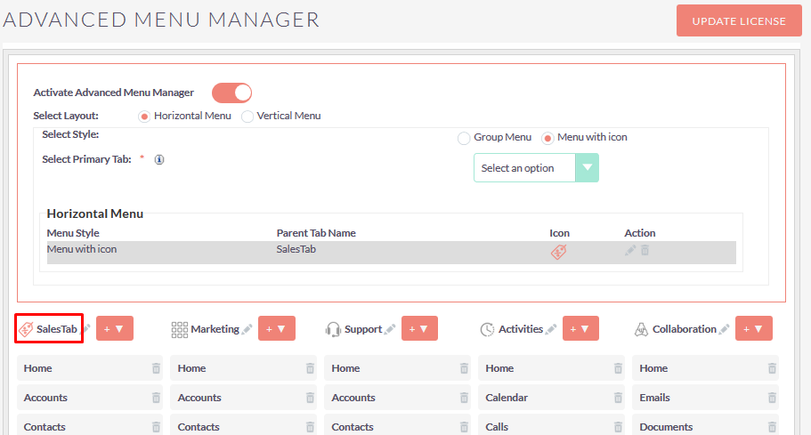
To update Primary Tab Label, Click on the pencil icon as shown in the below screenshot.
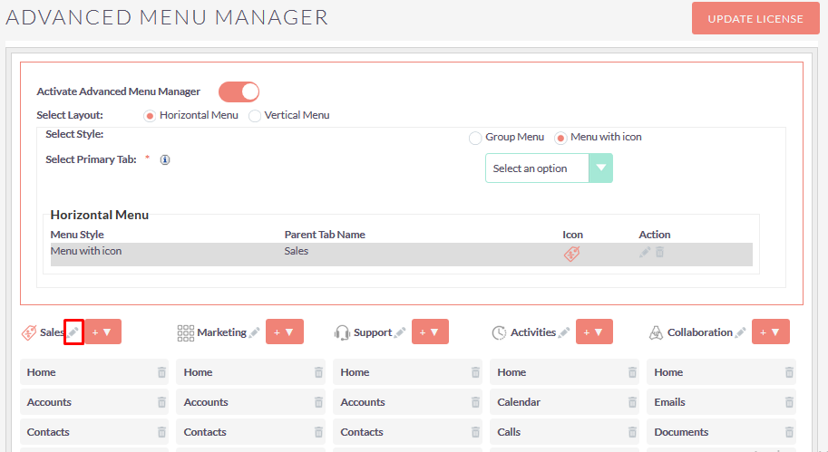
On click of pencil icon, the configuration page will be shown as below screenshot.
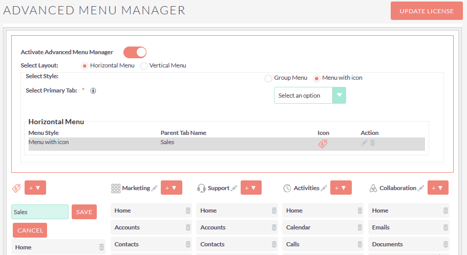
Step 17:
Enter Primary Tab Label which you want to add for that Tab and click on “SAVE” button to save Primary Tab Label.
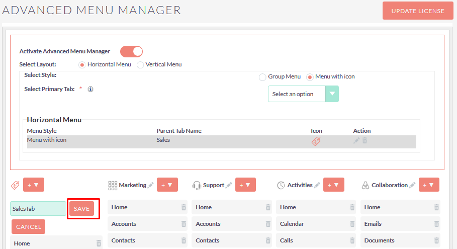
After click on the “SAVE” button, Primary Tab Label will be updated as shown in the below screenshot.
Step 18:
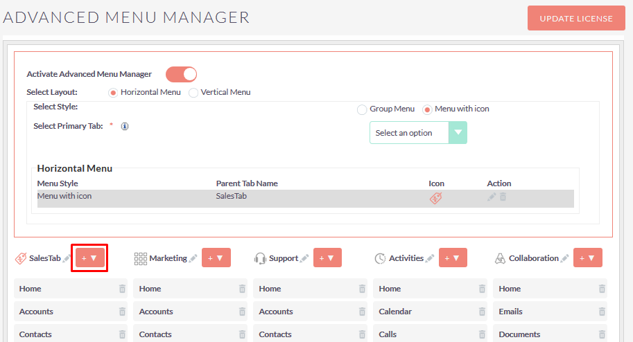
To Add Module, Add Link and Add filter in Particular Primary Tab, click on the “+ ▼ ” button as shown in the below screenshot.
Step 19:
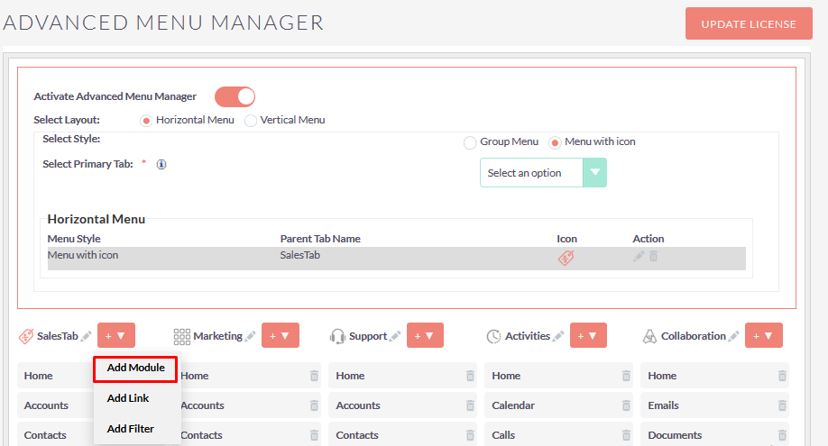
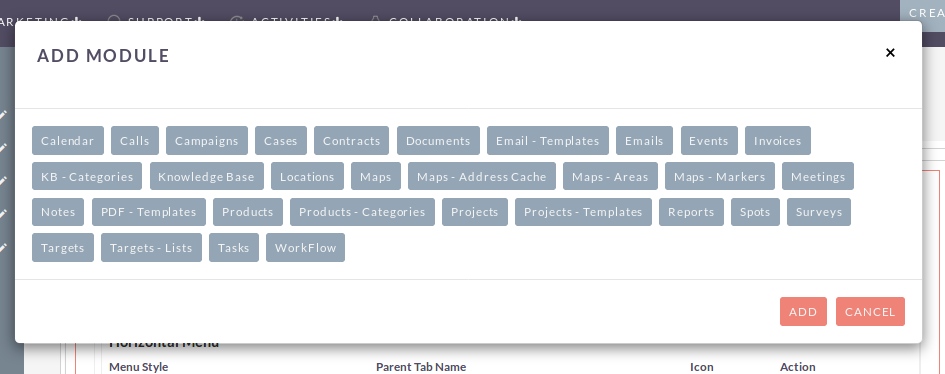
To Add Module in Particular Primary Tab, click on “Add Module” form “+ ▼ ” button. On click of “Add Module” open popup, as shown in the below screenshot.
Step 20:
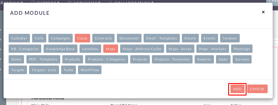
To Add Module in Particular Primary Tab, select single or multiple modules and click on the “ADD” button as shown in the below screenshot.
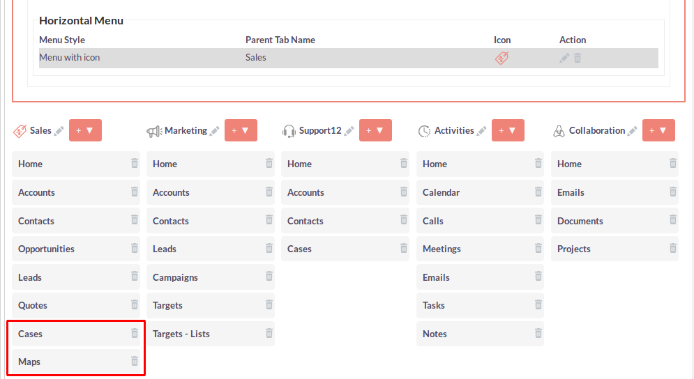
After Click on “ADD” button, selected module(s) will be added in that Primary Tab, as shown in the below screenshot.
Step 21:
Once you Click on the Cases Module Link, Cases Module ListView Page Will be Open


Step 22:
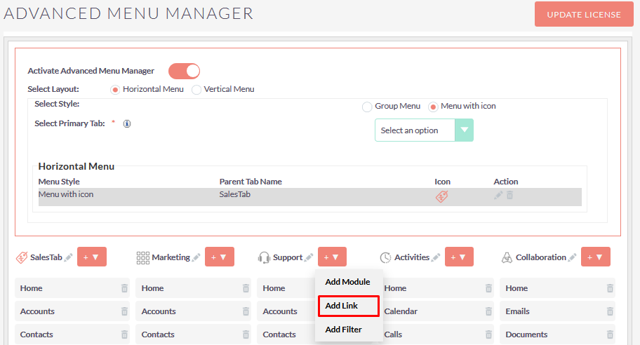
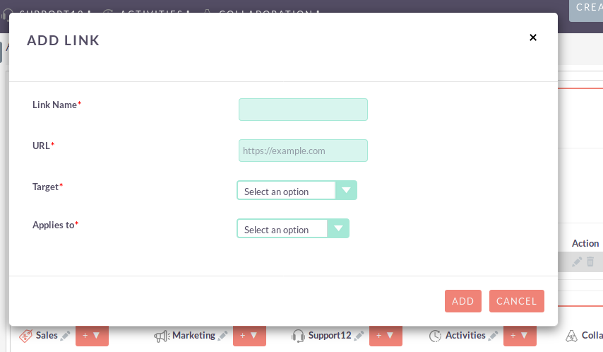
To Add Link in Particular Primary Tab, Click on the “Add Link” form “+ ▼ ” button. On click of “Add Link”, Popup will be open as shown in the below screenshot.
Step 23:
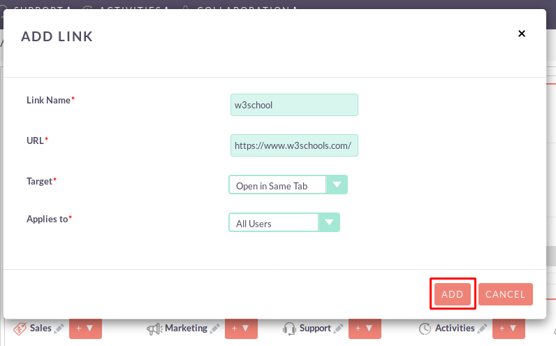
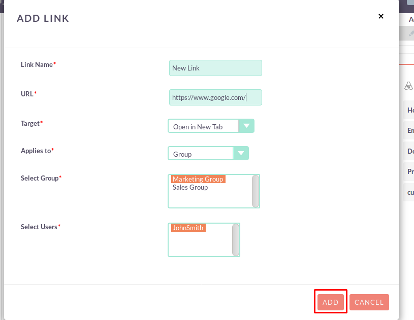
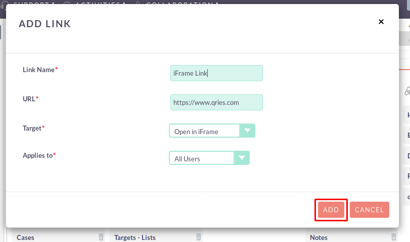
Enter all values and click on “ADD” button to Add custom Link Data.
- If “Target value” is “Open in Same Tab” and “Applies to” value is “All Users” then Link will display for all users.
- If “Target value” is “Open in New Tab” and “Applies to” value is “Group” then Link will display for selected user(s) from Group.
- If “Target value” is “Open in iFrame” and “Applies to” value is “All Users” then Link will display for all users.
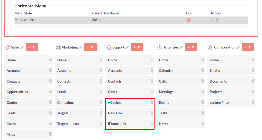
After Click on “ADD” button, Added Link will be displayed in that Primary Tab, as shown in the below screenshot.
Step 24:
Once you Click on the Custom Link, it’s redirect to the link page which was added in configuration. Custom Link shows in the Menu depending on Users Role and Group.
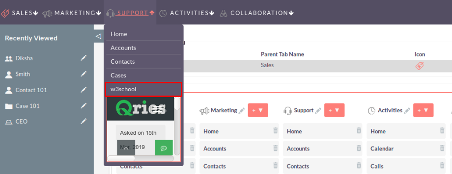
- If Selected Target is “Open in Same Tab”, Link will be open in same Tab.

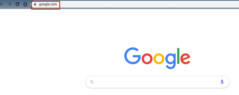
- If Selected Target is “Open in New Tab”, Link will be open in New Tab.

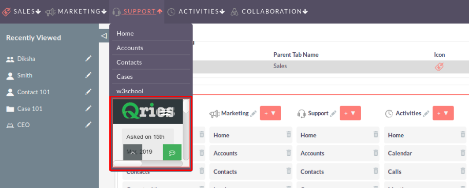
- If Selected Target is “iFrame” Link will be open in iFrame.
Step 25:
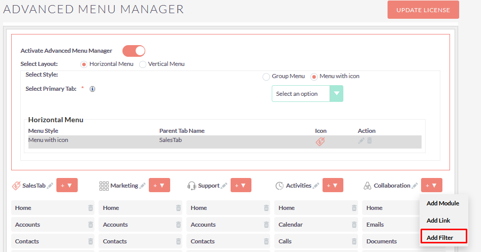
To Add Filter in Particular Primary Tab, click on the “Add Filter” form “+ ▼ ” button. On click of “Add Filter”, Popup will be open as shown in the below screenshot.
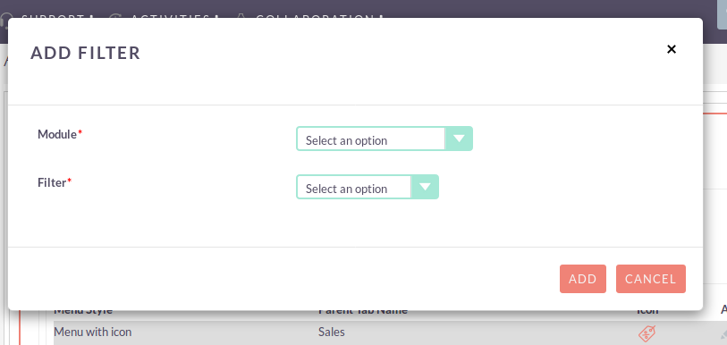
Step 26:
If selected Module has no filter then it will show Alert Message as shown in the below screenshot.
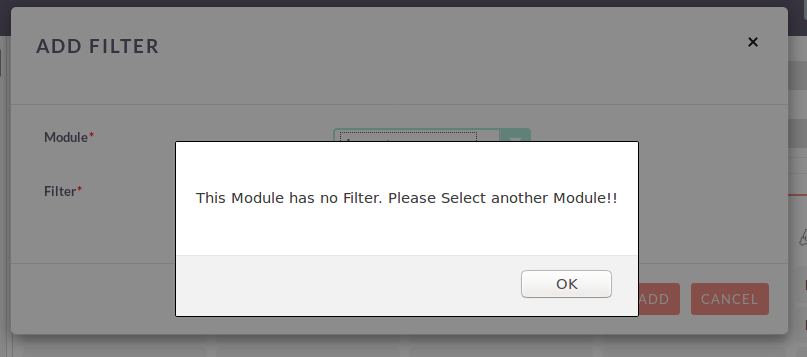
Step 27:
To Add Filter in Particular Primary Tab, select all required field and click on “ADD” button as shown in the below screenshot.
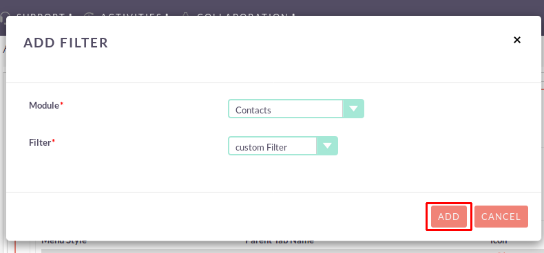
After Click on “ADD” button, added Filter will be display in that Primary Tab as shown in the below screenshot.
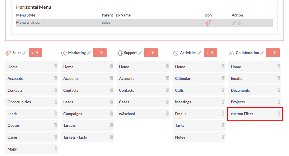
Step 28:
Once you Click on the Filter, Module ListView Page will be open according to that Filter.
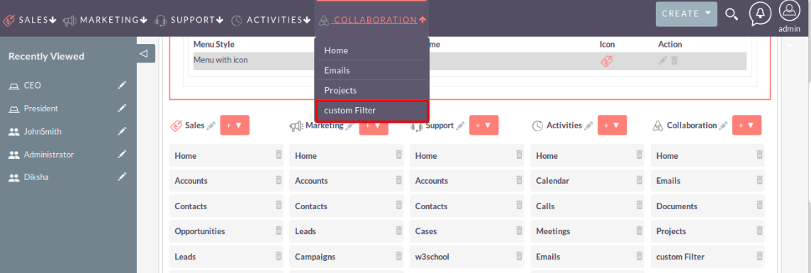

Step 29:
To delete any menu sub items, Click on the delete icon as shown in the below screenshot.
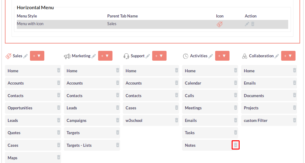
Step 30:
Once you Click on the Delete icon, Alert Box will be displayed. If you click on the OK button from Alert Box, then the record will be deleted.
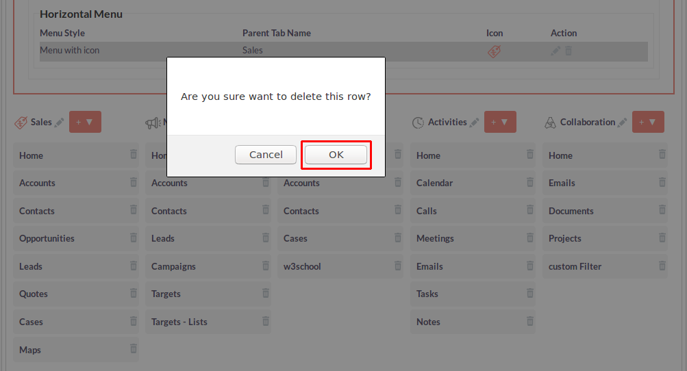
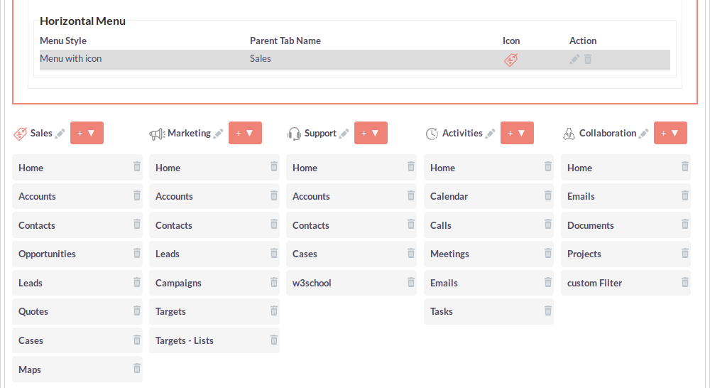
Step 31:
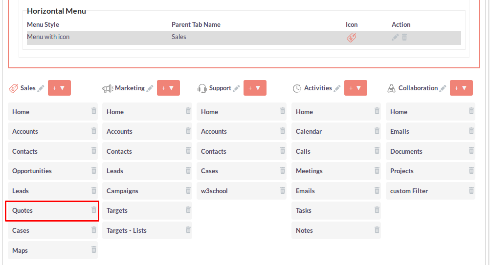
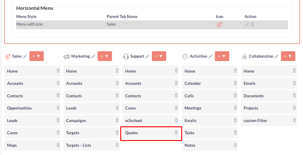
If you want to Drag and Drop menu sub item from one Primary Tab to another Primary Tab then drag sub item from one Primary tab to another Primary tab.
- Before Drag and Drop menu sub item
- After Drag and Drop menu sub item
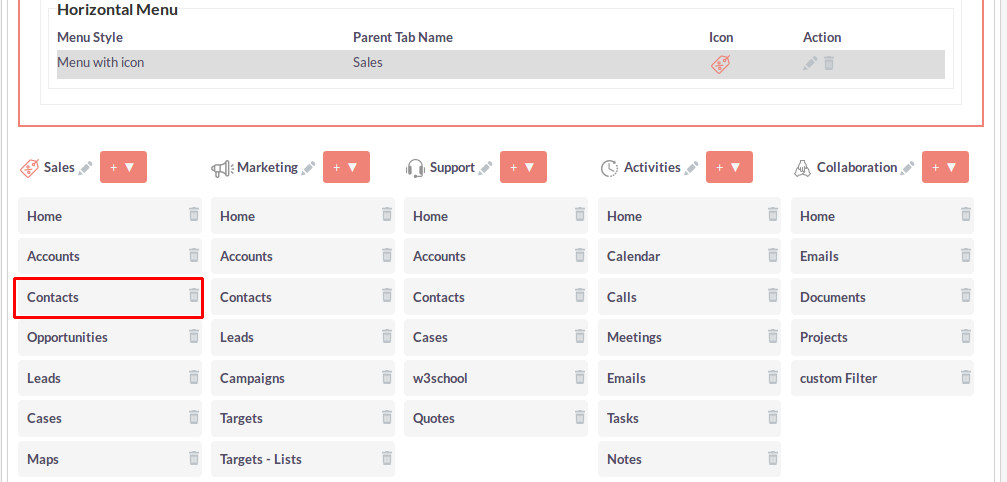
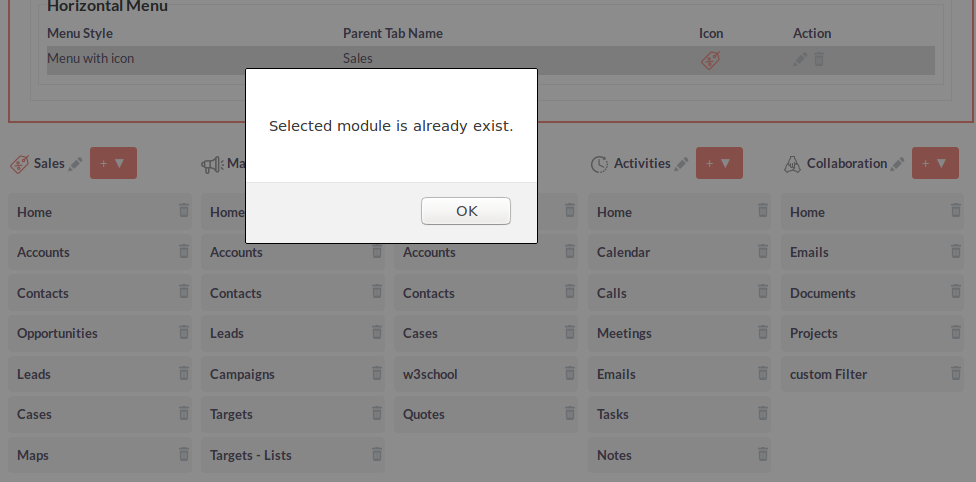
While Drag and Drop menu sub item, Draggable Module is already exists in Droppable Primary Tab at that time that module should not be added in Primary Tab and it will show Alert Message.
For Example: Drag Contact Module from Sales Primary Tab and Drop in Marketing Primary Tab but Contact Module is already exists in Marketing Primary Tab. So it’s shows alert message that “Selected Module is already exist”.
Step 32:
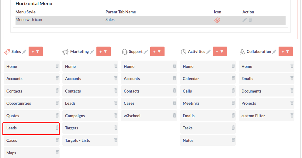
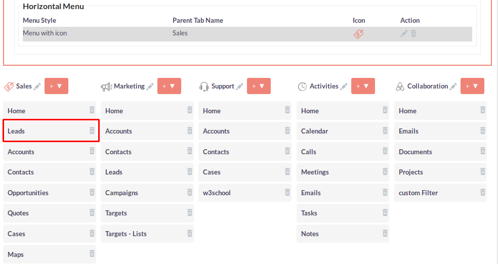
If you want to Drag and Drop menu sub item in same Primary Tab then you need to drag and drop menu item in same primary tab like up/down.
- Before Drag and Drop menu sub item
- After Drag and Drop menu sub item
Step 33:
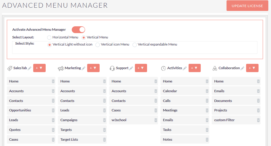
If you select Vertical Menu from layout and selected style is Vertical Light without icon then the configuration page will be shown as below screenshot.
Step 34:
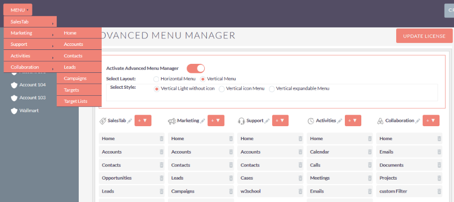
If you select Vertical Menu from layout and selected style is Vertical Light without icon then the Menu will be shown as below screenshot.
Step 35:
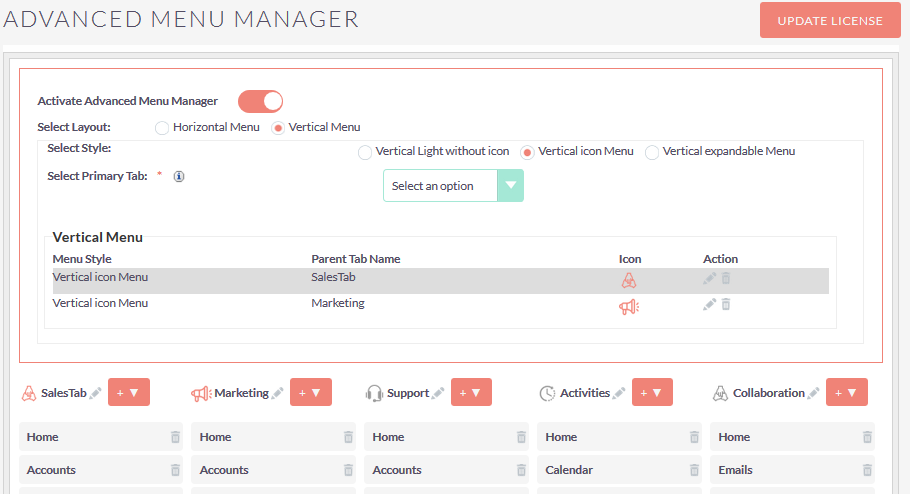
If you select Vertical Menu from layout and selected style is Vertical icon Menu then the configuration page will be shown as below screenshot.
Step 36:
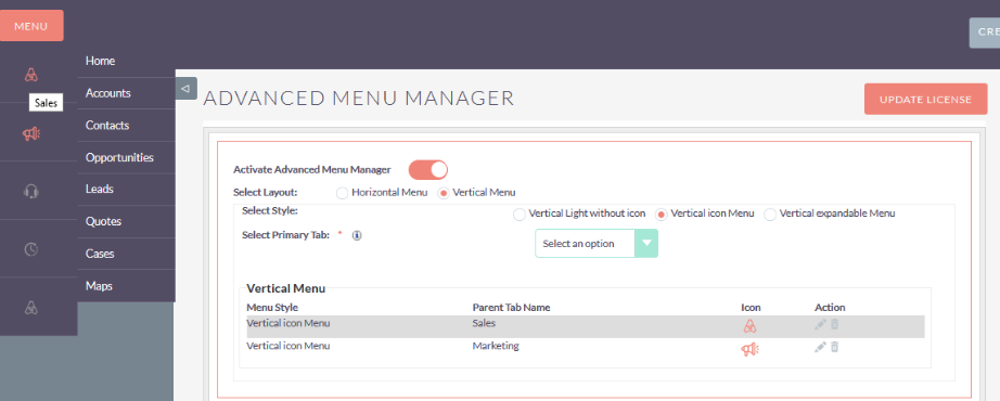
If you select Vertical Menu from layout and selected style is Vertical icon Menu then the Menu will be shown as below screenshot.
Step 37:
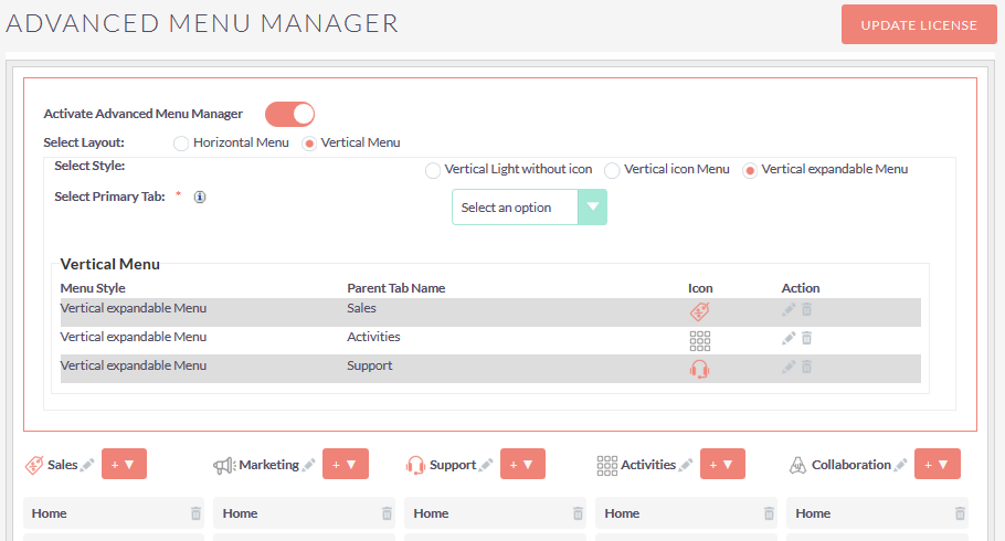
If you select Vertical Menu from layout and selected style is Vertical expandable Menu then the configuration page will be shown as below screenshot.
Step 38:
If you select Vertical Menu from layout and selected style is Vertical expandable Menu then the Menu will be shown as below screenshot.
