A new update to the popular Analytic Reporting Pro has been released that includes many new features including Excel template support, new chart types, new report filters, MSSQL support and more.
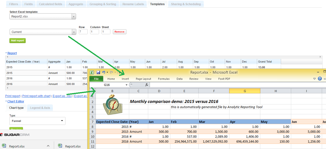
Formatted Excel Templates
You can format your own Excel templates in order to have the Analytic Reporting Tool output the report data in your formatted Excel template. In order to do this, start by creating an Excel file that you will use as a template. In your Excel template you can add logos, colors, define the text format, formulas and even Excel charts. When the Excel file is ready, an admin user can upload it under Analytic Reporting Tool Settings-> ‘Templates’ tab.


New Chart Types
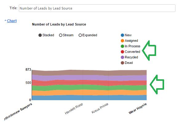
New chart types: Area chart, Horizontal Bar Chart (in addition to already existing chart types of: Pie, Line, Column, 3-axes chart, Geographic, Funnel, Gauge)
Under Legend & Axis you can now identify what should be displayed in your Area Chart. When choosing ‘Stacked’ and the selected ‘Legend’ source is a dropdown type field (e.g. ‘Status’) you will be able to drag & drop the order of the values to be displayed in your Area chart.

Additional Filters
It is now possible to filter by the assigned main team or all teams assigned to the object. In addition, there is now the ability to filter on the last # of weeks, months, or quarters. Want to see what has happened over the last 6 months? Select "# of Last Months" and enter 6. The report will then set the date filter accordingly.
Permissions
Need to lock down reports to be read only for some users, but want them to be able to set their own filters? You can now set permissions to do exactly that.
Advanced Calculation Editing
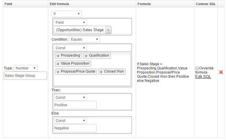
The formula creator lets you do some pretty advanced reporting, but if you want even finer control you can now edit the generated formula for greater precision.

MSSQL Support
MSSQL is an often requested ability and now it is fully supported.
Learn more about Analytic Reporting Tool Pro and why it is so popular. Want a personal demo? Click on the link under the Schedule a Demo section of the page to get started.
-
Advanced Menu Manager

Configure stylish and functional menus in SuiteCRM that are more relevant to your team’s needs and match your branding. The Advanced Menu Manager add-on enables you to choose different menu layouts and designs from the Admin settings – no designer needed!
-
Mailchimp Extension

Mailchimp Extension allows you to sync the mailchimp details with SuiteCRM and SuiteCRM details to mailchimp
- Show more addons
